Do not make your website header scary – Tips to make it beautiful
Since header of a website takes up a significant portion of the above the fold section, it makes perfect sense to make it look as simple and beautiful as possible. Failing to do so may result in drastic increase in bounce rate. So, quite obviously, it is the header that can make or break the whole thing. An interesting and engaging header will go a long way to ensure a better web presence and happy users ‘s experience, whereas a dull header image can kill the whole thing and even in some worse cases, make the visitors hate your website. You certainly do not want this right? Of course, you do not. So make your task easy, here we are going to share some tips that can help you have a great, if not jaw dropping header image for your website:
Don’t forget to subscribe to our RSS or Follow us on Twitter if you want to keep track of our next post.
Try Something New
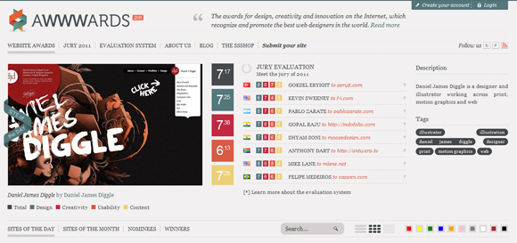
The same old and boring rectangular header image is not going to help your website getting cozy with the targeted audience. You need to go extra mile with the header and come up with something that makes your website look out of the box. Visit some popular sites like CSS mania, CSS award and try to get some inspirations from the websites that are featured there. Once you are filled with creative juice and confident, you should go for something new, something that people have never experienced before. However, if you are still clueless where to start, here we are going to share some tips that you can give it a go:
Submerge
This is a unique way to make your website header looks irresistibly beautiful and awesome. Rather than going for the same rectangular header image that does not fit with the rest of the other elements of the website, you can simply blend the header with the background color of the website. All you have to do is to make the header look a part of the entire design by merging it, as far as possible, with the rest of the web design. This can be done by making it look less complicated or by using background color gradient. However, you are free to add your own creativity in the process.
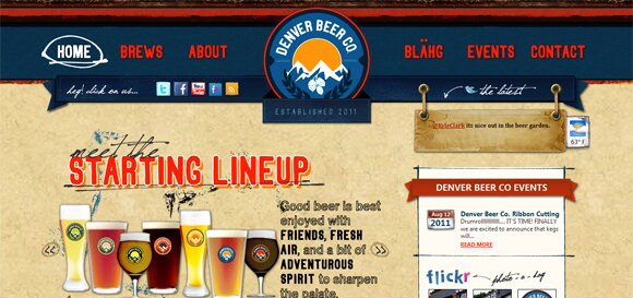
Break The Rules
jQuery and flash are both good to add interactivity in the website header and there is no denying of the fact that they are quite popular among website designers. But the fact is that, jQuery and flash are now being used by almost all website designers and therefore, they do not have the element of surprise that can hook on the attention of visitors. So, it makes sense to use a combination of both dynamic and static header to make the whole experience unique and interesting to the targeted visitors. However, I am not asking you to remove Flash and jQuery from you designing toolbox. Rather what I am saying is that you should try other verticals so the outcome looks impressive.
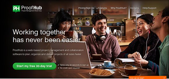
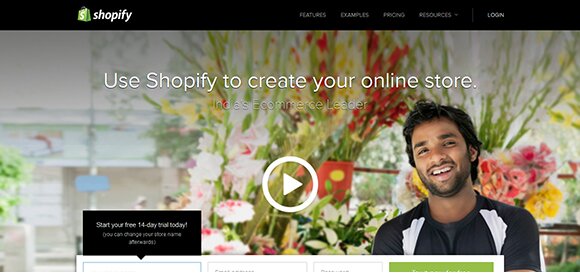
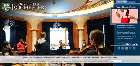
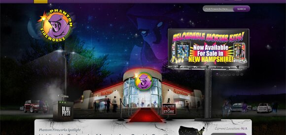
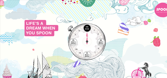
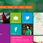
Huge Header
Large header is now in the vogue as it gives ample opportunities to designer to come up with something awesome and to give wings to his creativity. However, it has a risk associated with it. Yeah, it will take up almost 90% of above the fold section and that means, if anything goes wrong, your website will suffer badly. But do not feel despondent because there are some glorious examples available to inspire you.
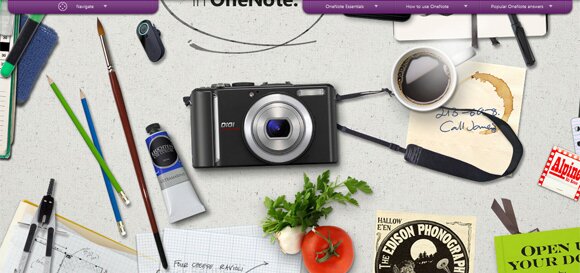
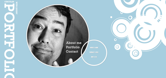
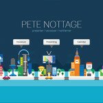
Use Illustrated Character
Use of illustrated character is another great way to break free from the prevalent web design trend. However, it has its share of shortcoming. You have to work hard to your bone to make the illustrated character look good, otherwise the whole effort will go wasted.
Author: Michael Evans
Michael Evans is a passionate blogger and he is also using website builder by Site2You for designing great websites.


